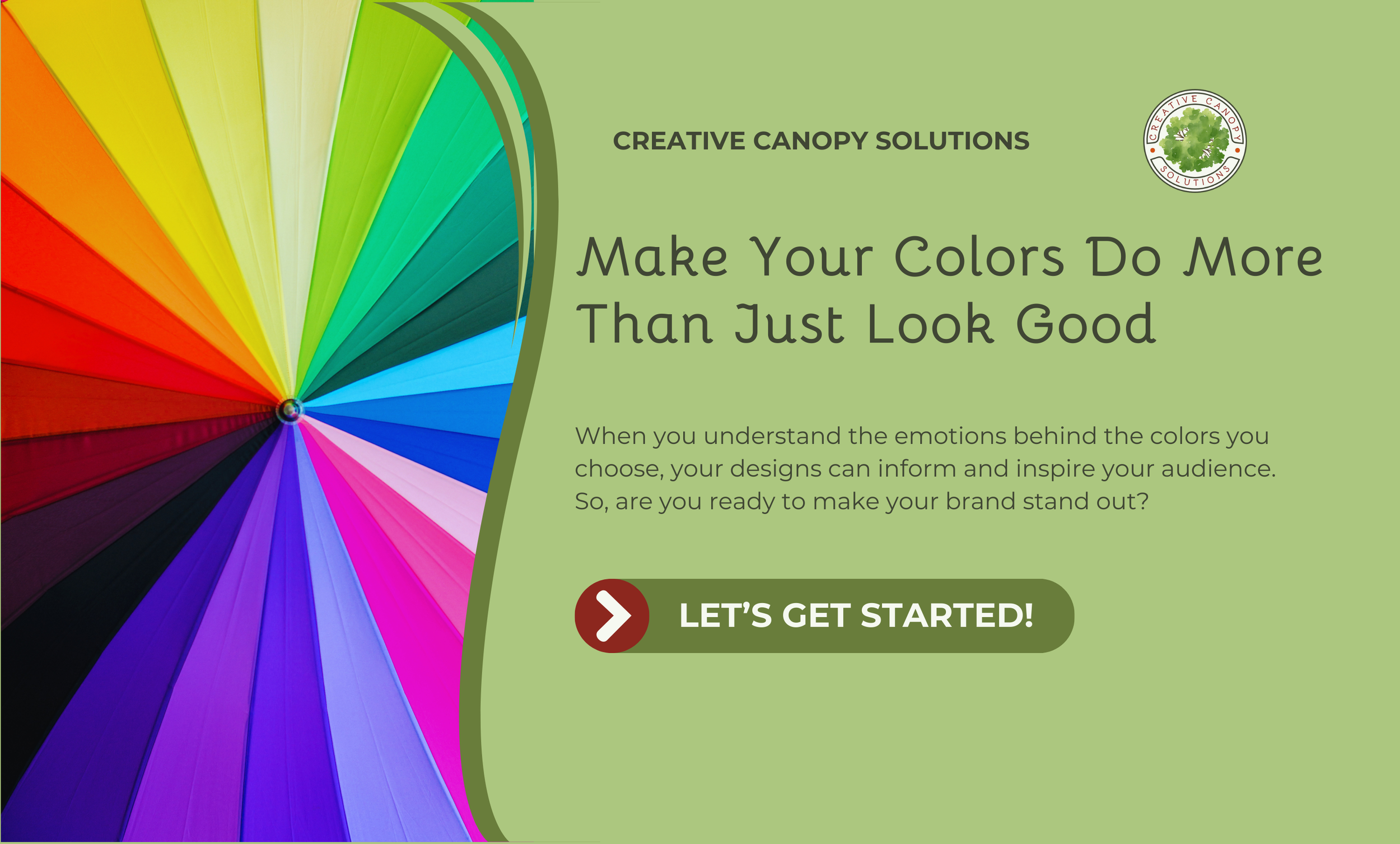

Understanding Color Psychology: A Graphic Designer's Guide to Success
Have you ever wondered why some logos make you feel calm while others seem to energize you? That’s the power of color psychology at work. Color psychology is the study of how colors influence our emotions, thoughts, and behaviors. Since studies found that it can influence 85% of customers’ purchasing decisions, knowing how it works is key to creating effective designs..
While personal preferences and cultural influences will shape our individual reactions to colors, there are consistent patterns in how certain ones make people feel. For graphic designers, understanding these patterns is essential to building strong visuals and connecting with your ideal audience.
Colors are generally categorized into three main groups: warm, cool, and neutral. The colors in these groups evoke similar feelings and set the tone for how your audience will view your design.
Now, let’s explore each group and find out which colors fall into which categories.
Warm Colors
Warm colors are often associated with energy, warmth, excitement, and action. If you’re looking to create a sense of urgency or make an element stand out, colors like red, orange, yellow, or pink might be best. Your audience is more likely to feel enthusiastic and confident when interacting with these colors, making them especially effective in industries like food, entertainment, fashion, or fitness. Be careful when using warm colors, however. If they are used in excess, they can make people feel overstimulated, aggressive, or intense, causing them to turn away from your business.
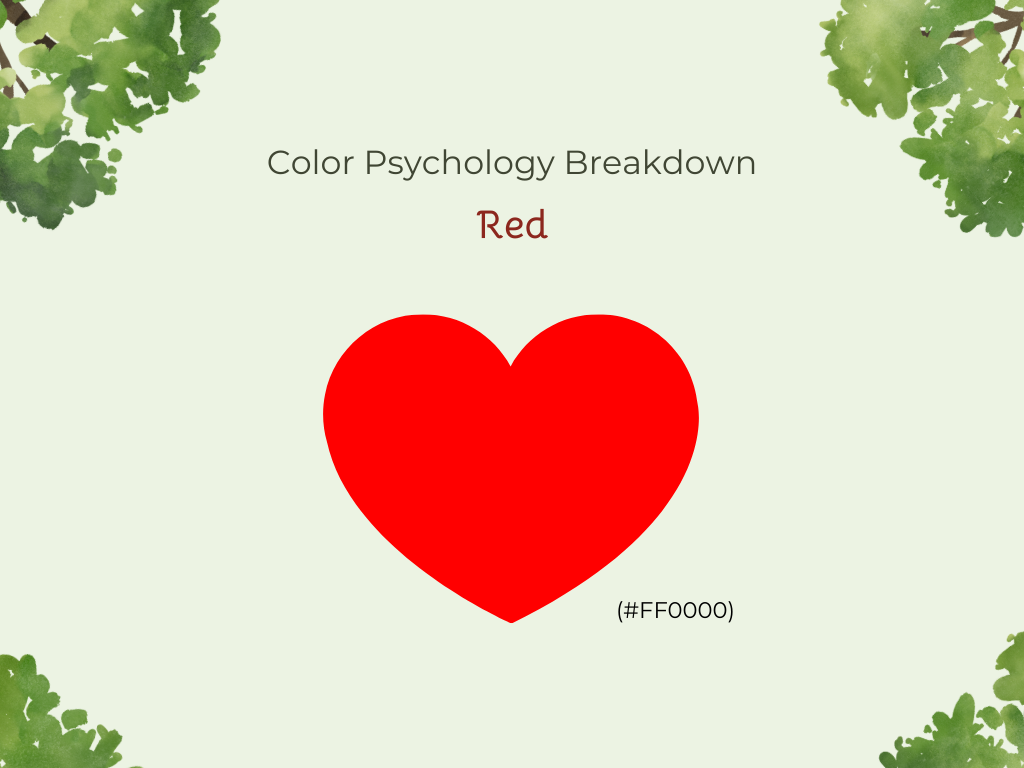
Red
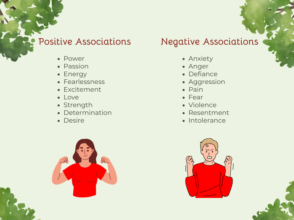
Because red is highly effective at grabbing attention, it’s often used for call-to-action buttons, sale tags, and any element that needs urgency or immediate focus. Red is most commonly associated with feelings of:
Power
Passion
Energy
Fearlessness
Excitement
Love
Action
Strength
Determination
Desire
Since red is used for police lights, stop signs, and other things that increase anxiety, an overuse of it can lead to negative feelings such as anger, defiance, aggression, or pain.


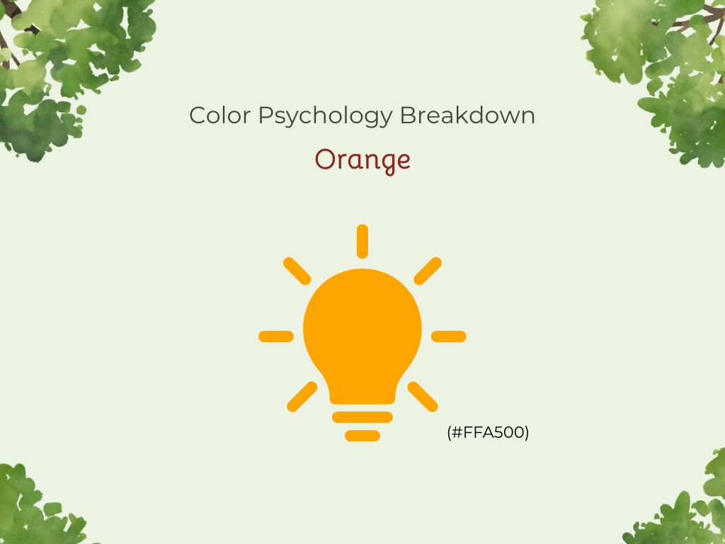
Orange
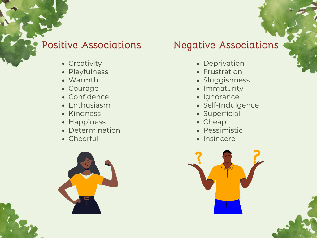
The color orange works great for noncorporate brands as it often encourages feelings of creativity and playfulness. Oranges can help people let go of their inhibitions and express themselves more freely. Since orange is often associated with the sun, it causes a feeling of warmth as well as:
Courage
Confidence
Enthusiasm
Kindness
Happiness
Determination
Be careful with oranges, though, because too much can cause feelings of deprivation, frustration, and sluggishness, and may be seen as immature or ignorant.

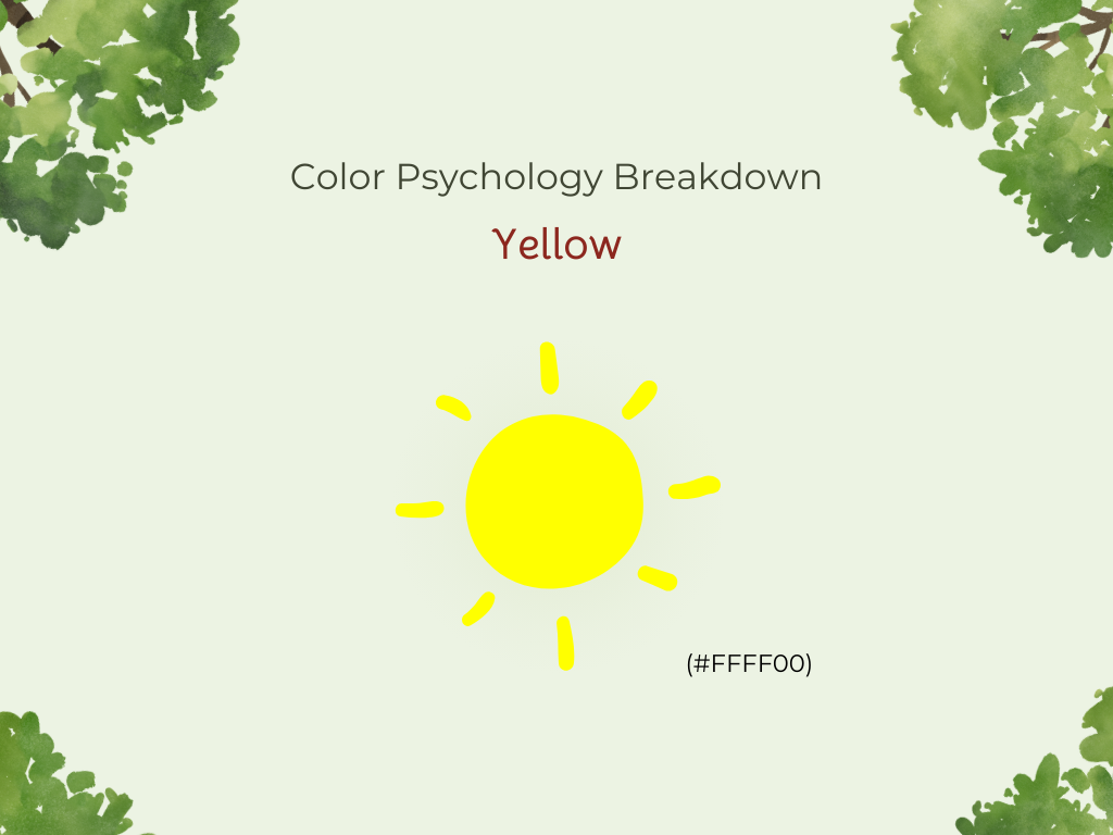
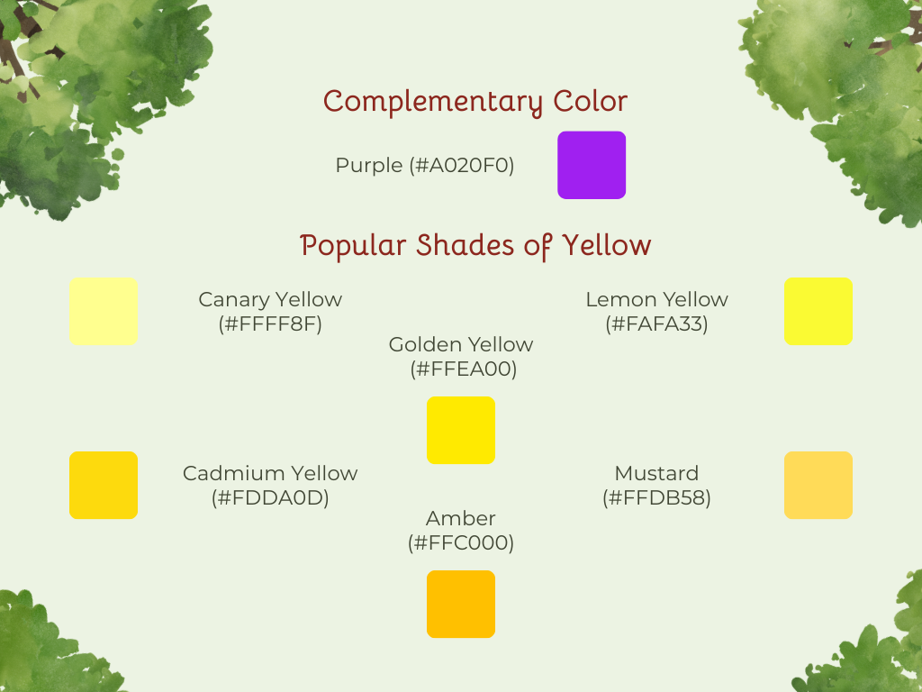
Yellow
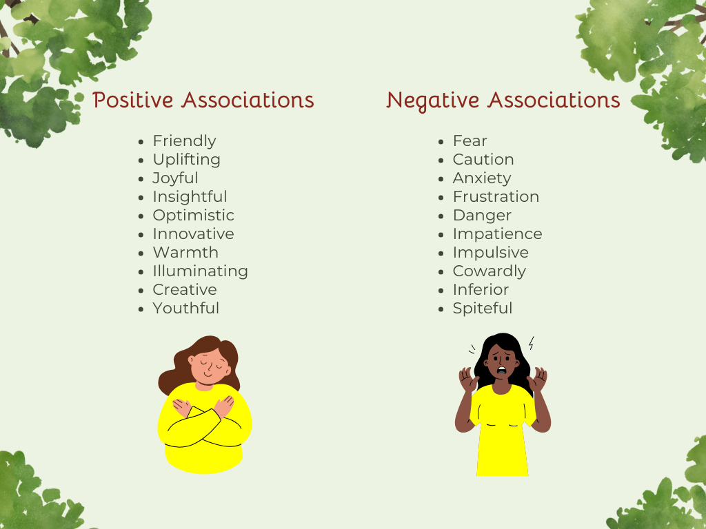
When you think of yellow, you might picture smiley faces, sunflowers, rubber ducks, or summer time, all things that spark feelings of happiness and joy. Yellow is a great choice for brands that want to appear friendly, uplifting, or full of creative energy. It’s also often linked to morning and the rising sun, which can make people feel more alert and insightful. Yellow also brings up feelings of:
Optimism
Innovation
Youthfulness
Hope
Energy
Warmth
Yellow does have its downside, though. Since yellows are used for things like police tape, traffic lights, and street signs, they may also cause feelings of fear, caution, anxiety, frustration, or danger.

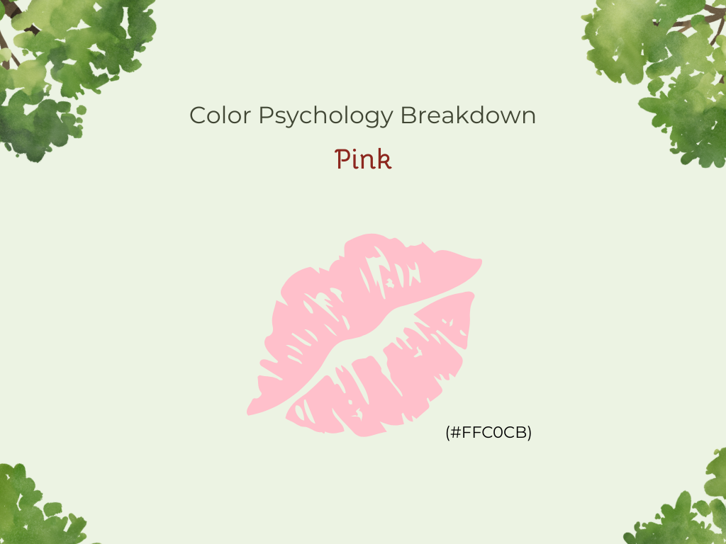
Pink
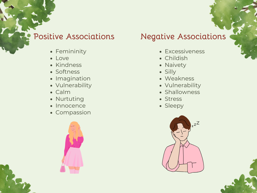
The color pink is most associated with femininity, love, and kindness. It’s a great color for brands that want to create a sense of softness or emotional connection. Depending on the shade, pink can evoke feelings of:
Imagination
Creative
Youthful
Vulnerable
Calm
Nurturing
Innocent
Some studies have shown that while pink is great for initial exposure, customers tend to get used to it quickly, causing it to become less effective over time. Pink can also be seen as excessive, childish, naive, or silly, so be careful not to overuse it.


Like what you’re reading? Download The Power of Color: A Guide to Color Psychology eBook and keep it with you anytime, anywhere.
Cool Colors
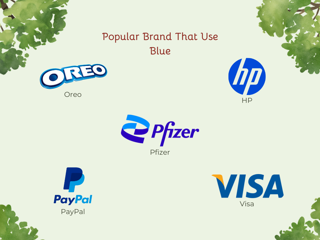
Blue, purple, and green fall in the cool colors group and are often used in corporate designs, healthcare, and technology brands. These colors tend to evoke feelings of calm, trust, professionalism, and stability. They are great for making the audience feel calm and at ease. However, when overused, they can have the opposite effect and leave people feeling cold or emotionally distant from your brand.
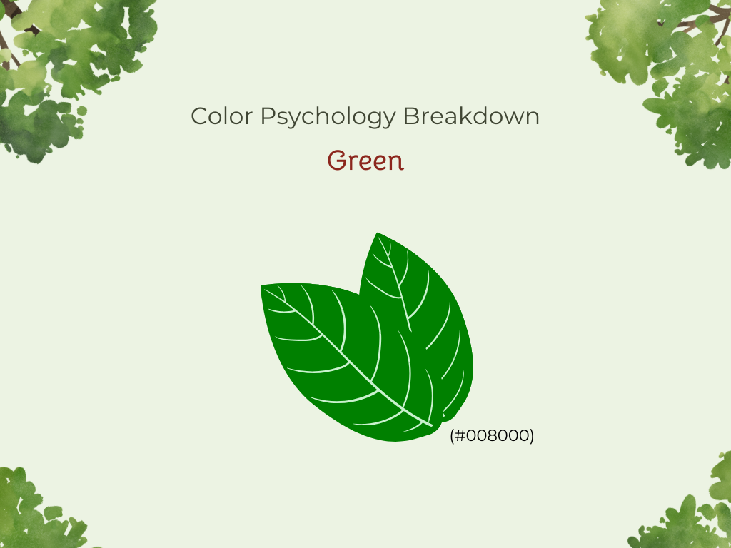
Green
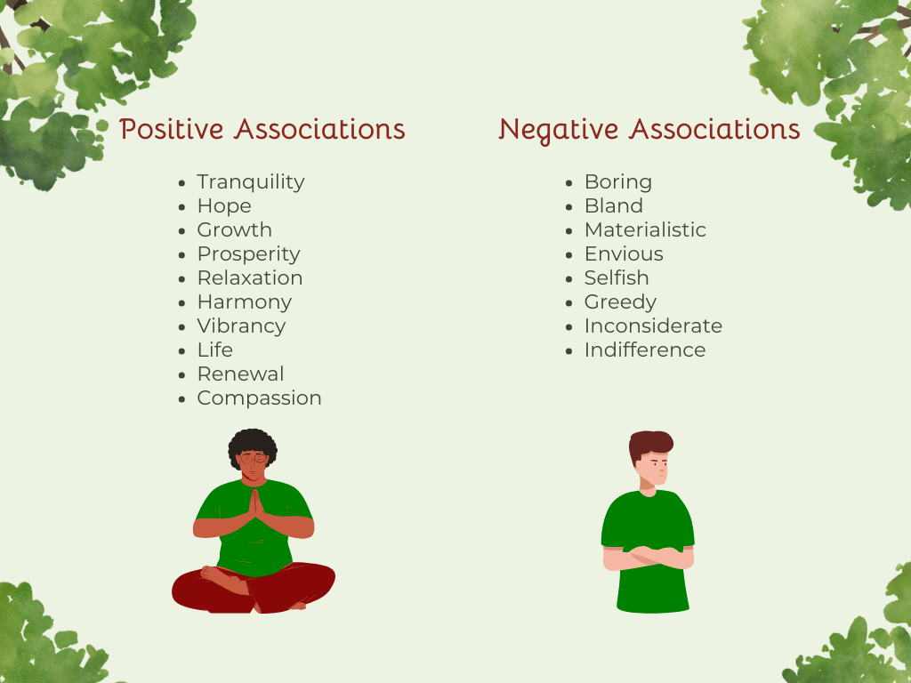
Greens represent life as they are found all around us in nature, from the grass to trees and bushes. It encourages us to return to our primal roots and focus on inner peace and tranquility. Some positive feelings and effects green can cause are:
Hope
Growth
Freshness
Prosperity
Relaxation
Invigoration
Harmony
Vibrancy
While greens are great colors to use to inspire and encourage your audience, they can have their downsides. Green can come across as boring, stagnant, or bland, so be careful when using green in your designs.


Blue
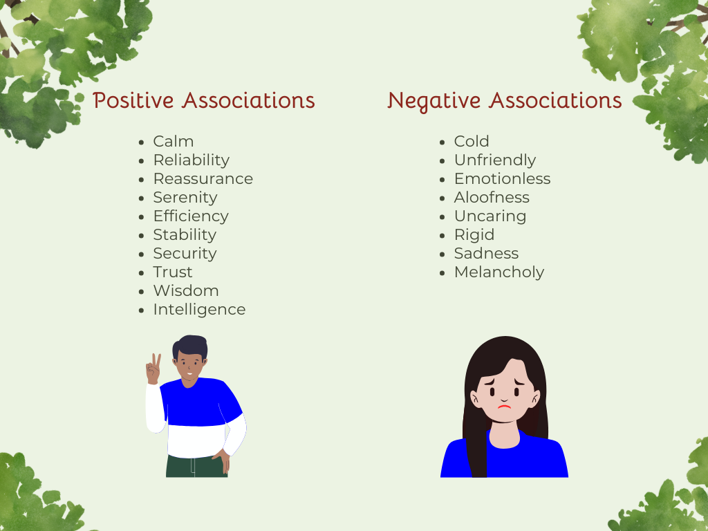
Think of a clear blue sky or the stillness of a calm blue lake. There’s something about the color blue that instantly slows the mind and soothes the soul. It’s often linked to feelings of reliability and reassurance, which is why so many brands use it in their designs. For many people, blue creates a sense of:
Serenity
Peace
Calm
Stability
Security
Trust
Wisdom
Inner reflection
Be careful with blues as they can also be seen as cold, unfriendly, and emotionless. Blue can even reduce appetites, so consider this carefully if you’re creating designs for restaurants or food-related brands.

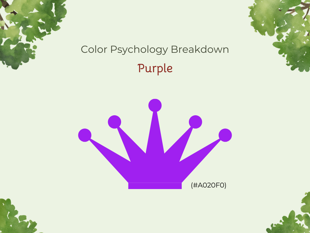
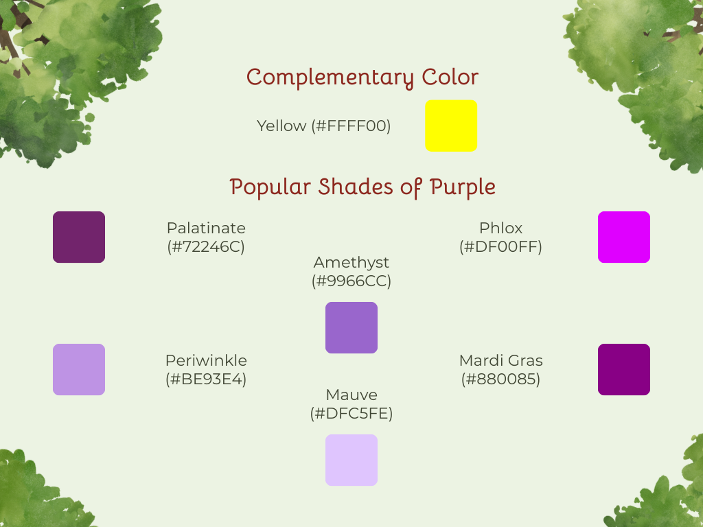
Purple
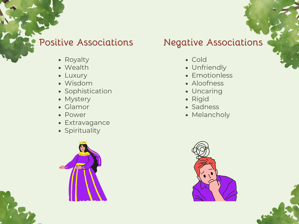
In ancient Rome, purple pigments were so rare and costly that they were more expensive than gold, which is why purple remains associated with royalty, wealth, luxury, and status today. Purples are also associated with:
Wisdom
Sophistication
Imagination
Mystery
Glamor
Power
Extravagance
Creativity
However, purples can be seen as overindulgent or moody if used too much, so be thoughtful of how you use them in your designs.
Neutral Colors
Neutral colors are subtle, unsaturated shades and hues that don’t appear on the color wheel. These colors are adaptable and great for supporting other colors without overpowering them.
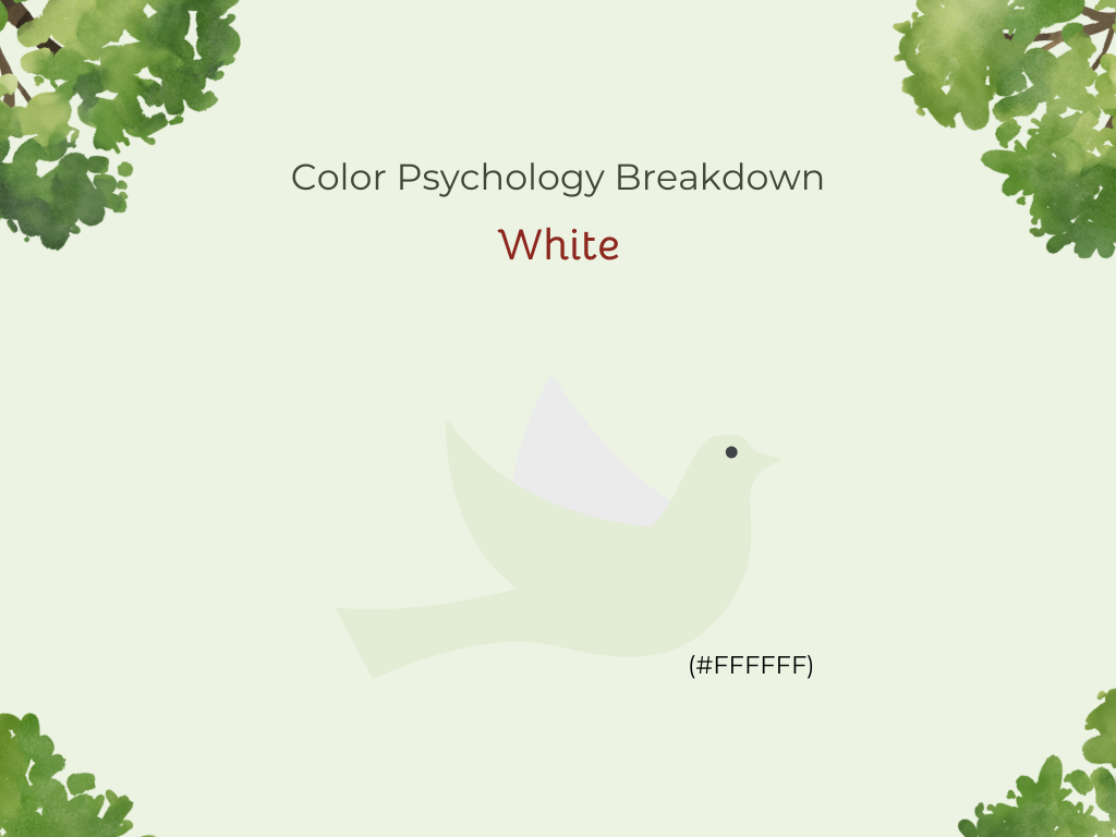
White
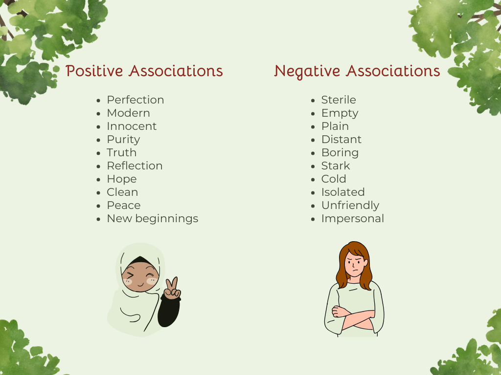
White is considered the color of perfection and has a modern, universal feel. It is often associated with new beginnings and starting anew. Try using white in your designs if you want your audience to feel:
Innocence
Purity
Truth
Reflection
Comfort
Hope
While white can be a powerful design choice, it’s important to be mindful of how and when it’s used. Instead of being seen as simple or clean, it may come across as sterile, empty, plain, distant, or boring. Be careful to balance this with other colors to avoid causing these negative feelings.


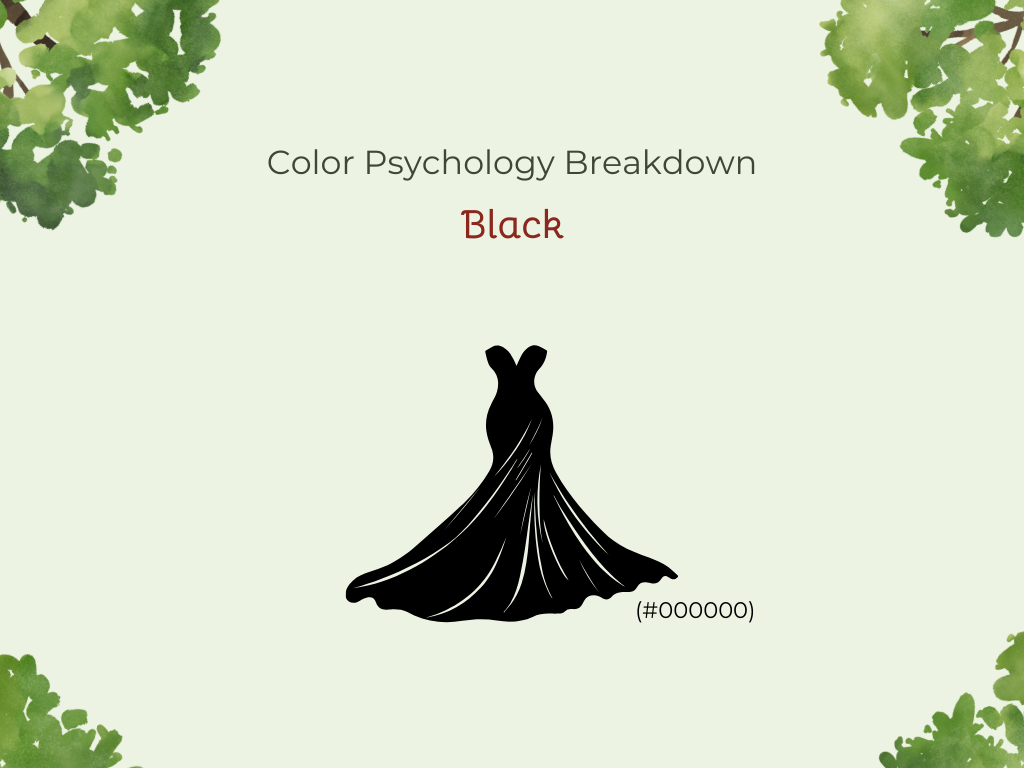
Black
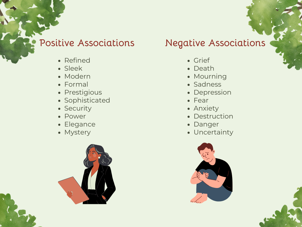
Black is highly versatile and can create a refined look. Its sleek, modern nature often makes it a favorite in industries that want a formal, prestigious feel, such as fashion. Your audience may associate black with:
Sophistication
Security
Power
Elegance
Authority
Mystery
Strength
Be very careful with black, however, because it does have many negative associations. Since it is a symbol of grief, it is also often associated with death, mourning, sadness, or depression. Black can also evoke feelings of fear and anxiety, so it’s important to use it sparingly, especially if in industries like healthcare or retail.


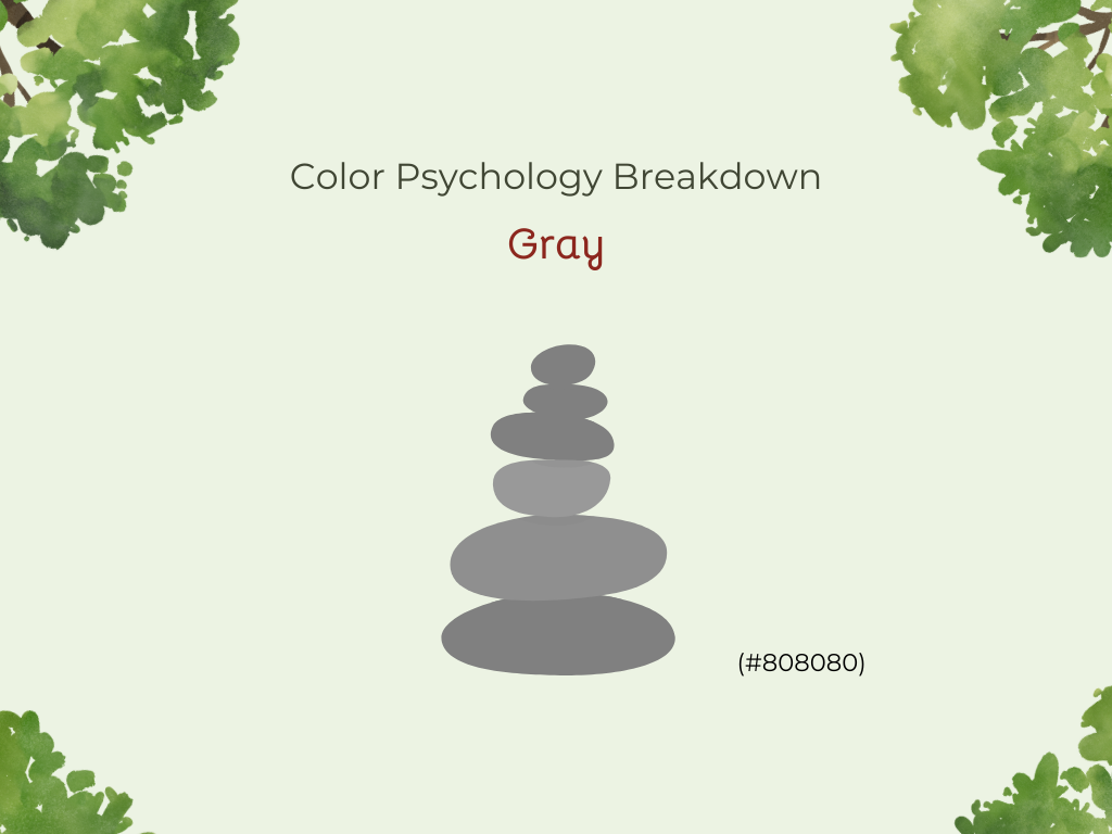
Gray
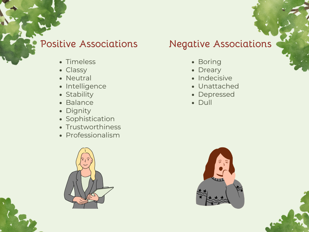
Gray is a great color to use when you want to create a timeless and classy design. It is perfect for a background color as it is neither too dark nor too bright. When paired with other colors, it’s great for businesses in the technology, finance, or healthcare industries. Use gray when you want to evoke feelings of:
Neutrality
Wisdom
Intelligence
Stability
Dignity
Sophistication
Calm
Professionalism
Trustworthiness
Luxury
Just like the other colors, gray has negatives, too. Instead of being seen as sophisticated or professional, the wrong use of gray can cause feelings of boredom, dreariness, indecisiveness, and unattachment.


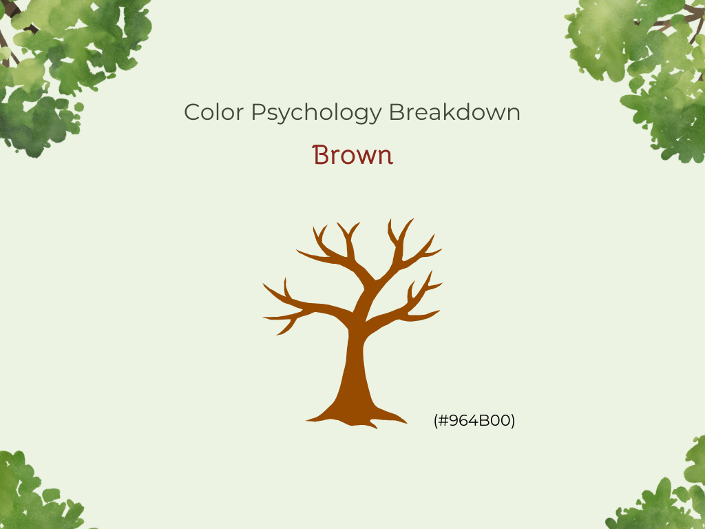
Brown
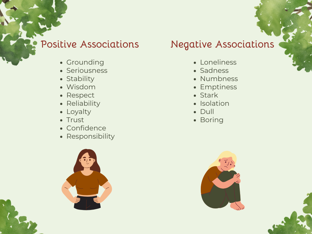
Brown is one of the most grounding and versatile colors as it reminds us of our connections to the earth, home, and family. This color is a great background or accent color as it tends to blend in while still keeping its strength. Brown is commonly associated with:
Seriousness
Stability
Wisdom
Respect
Security
Reliability
Loyalty
Trust
Confidence
Maturity
Responsibility
Browns are a darker color, so there’s a chance they will be associated with more negative emotions. Loneliness, sadness, numbness, and emptiness are all feelings that may be brought up when brown is used incorrectly. In large quantities, it may also be seen as vast, stark, and empty.


Creating a Color Scheme
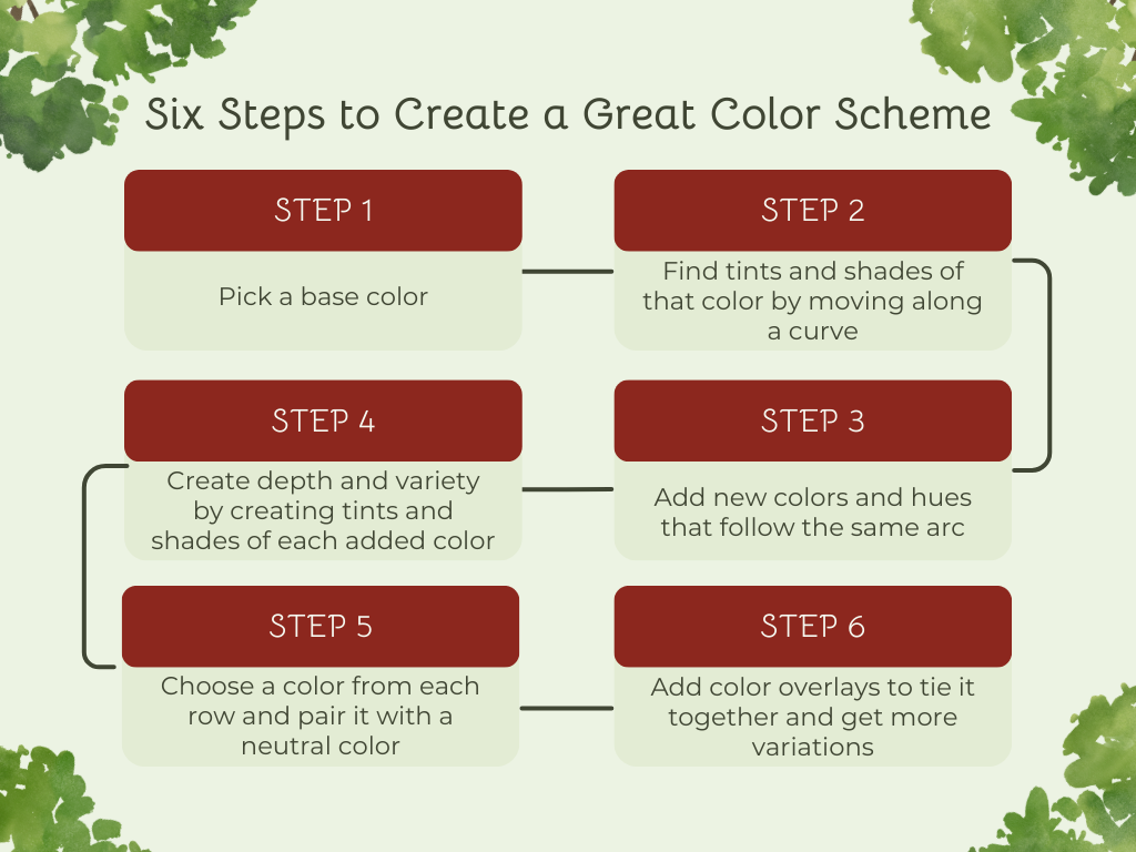
Having a color scheme for your brand to follow when creating designs is a great way to include a variety of colors while still keeping your visuals consistent and unified. Creating a color scheme may seem confusing, but it’s easy with this 6-step guide from Medium.
Pick a base color
Find tints and shades by moving along a curve
Add new colors and hues that follow the same arc
Create depth and variety by creating tints and shades of each added color
Choose a color from each row and pair it with a neutral color
Add color overlays to tie it together and get more variations
Another helpful tool for finding colors and building palettes is Coolors. While it doesn’t show a curved arc for the colors, it’s great for:
Locking in your base color and generating matching hues
Adjusting HSB values
Exporting palettes in HEX, RGB, or CSS
Saving and sharing palette variations for future use
Conclusion
The colors you choose for your brand and designs will influence how you are viewed, so take the time to make sure you find the right ones. Think about how you want your audience to feel when they work with you, and start from there. If you’re feeling stuck, look at ads, websites, and designs from other brands that you want to embody.
Also, keep in mind that colors will affect different people in different ways. Try out different color backgrounds and variations with A/B testing to find which works best for you and your audience.